
Overview
Marks & Spencer was losing ground online. Since 2007 its website had run on a platform provided by Amazon, and it could not keep up with what customers expected: slow pages, a checkout full of friction and a mobile experience that felt like an afterthought. M&S needed a platform of its own.
My Role
Scope
A new platform
Desktop / mobile / tablet
We launched the new site in February 2014, moved off the old Amazon platform and took production in-house.
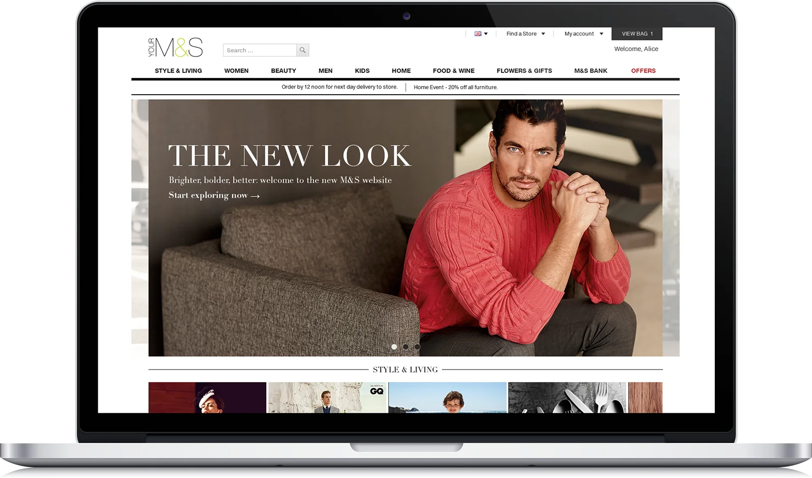
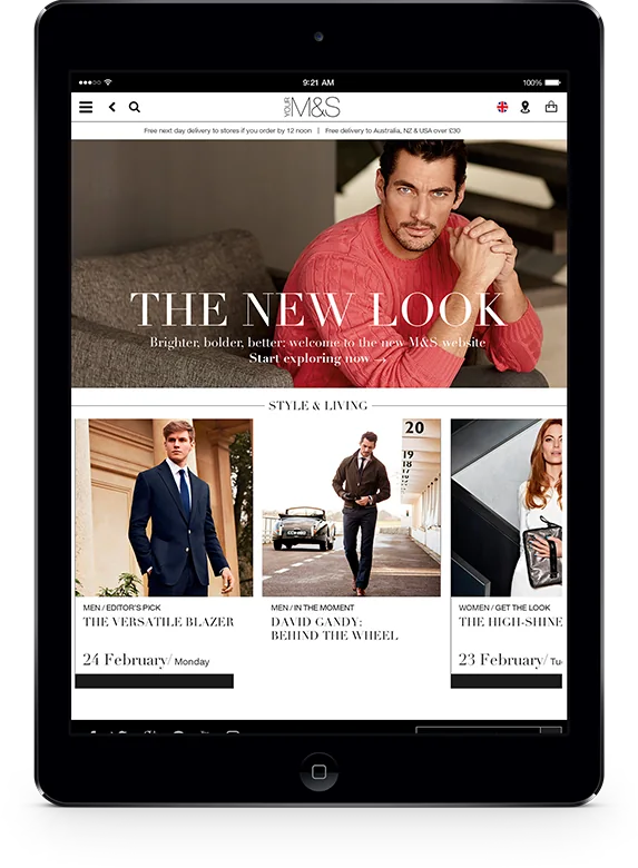
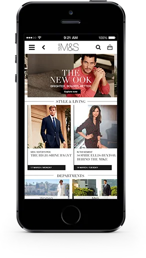
The home page
Menswear and womenswear
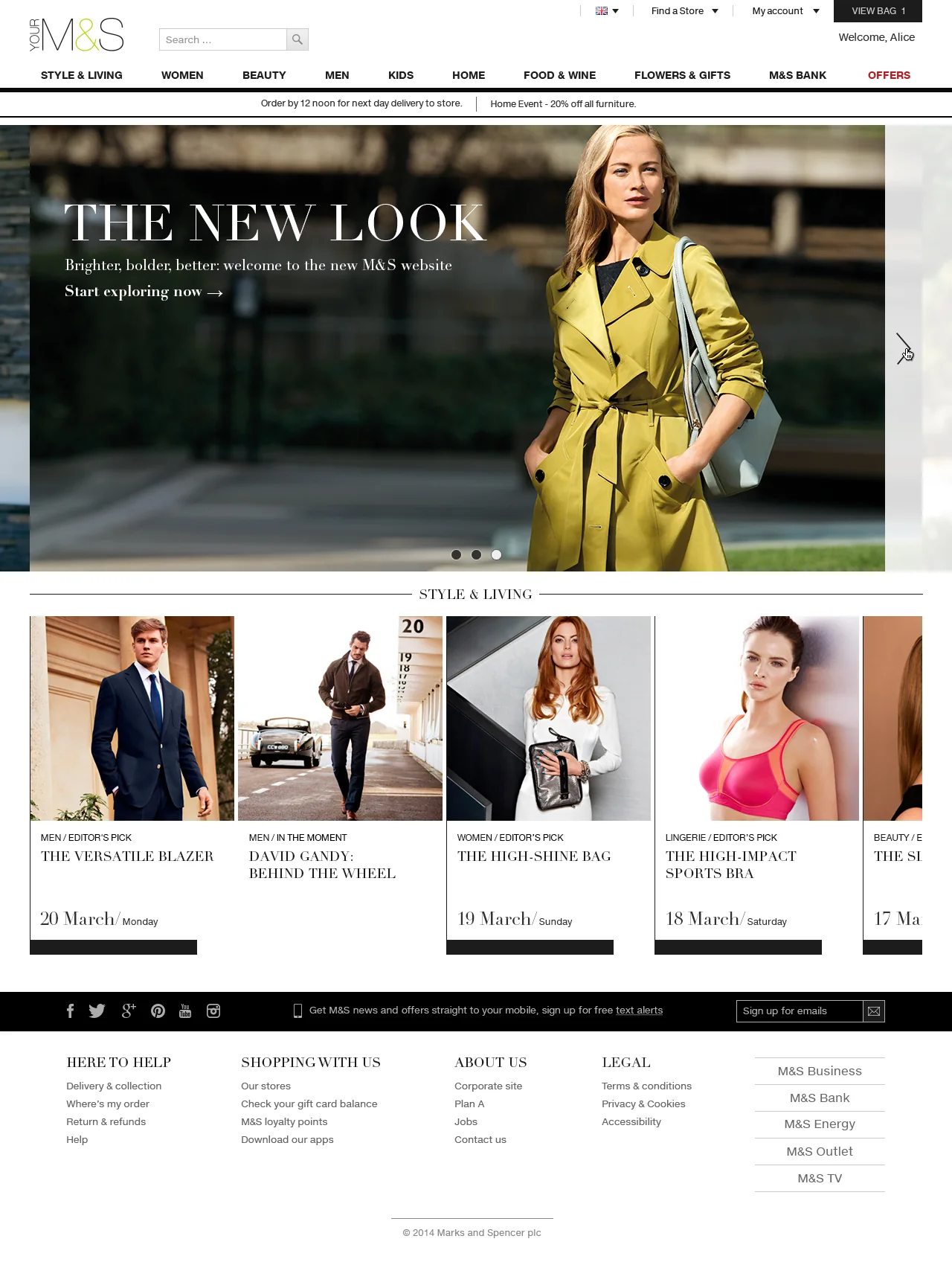
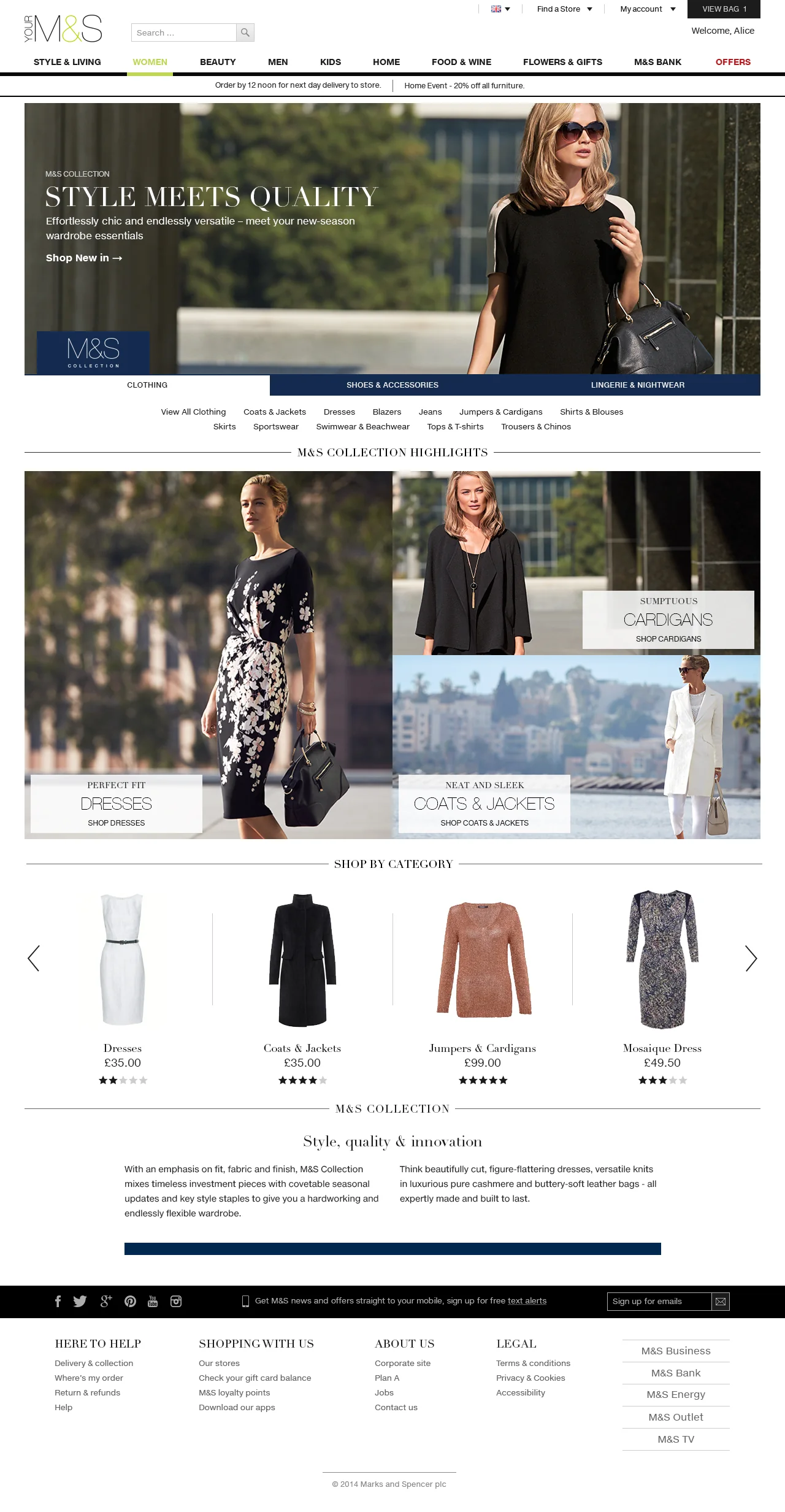
A full-width hero and the Style & Living carousel straight under it, so the content is part of the shop from the first screen.
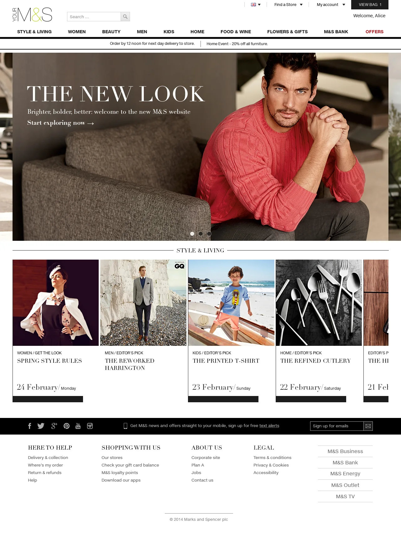
Website
E-commerce
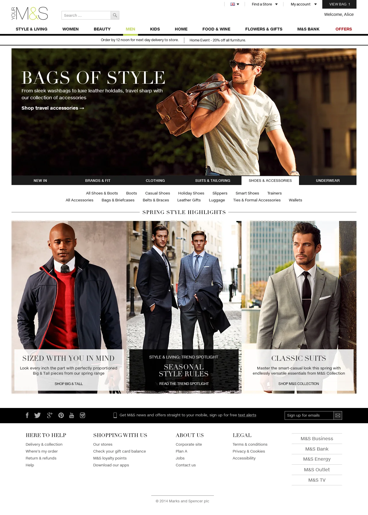
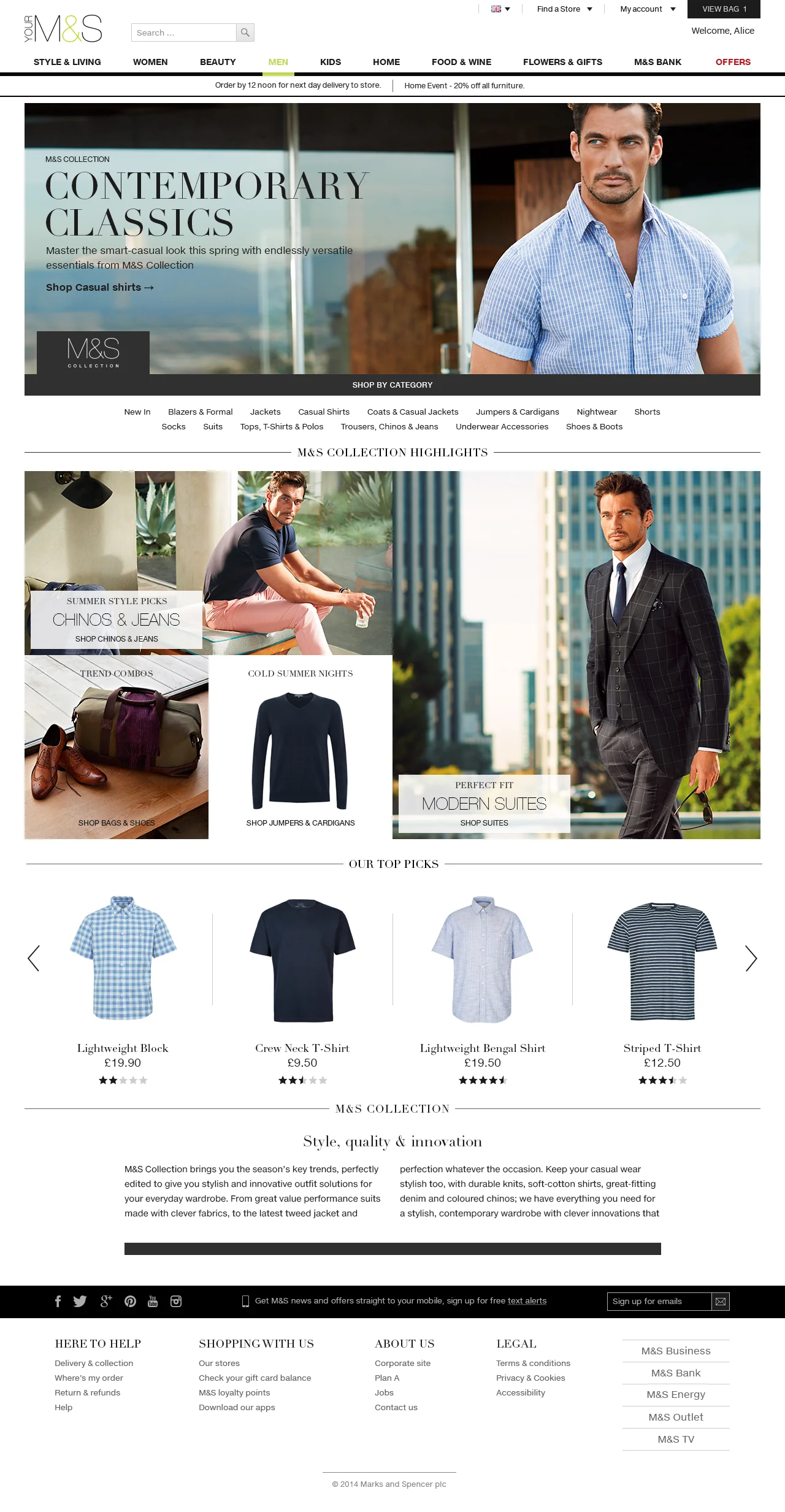
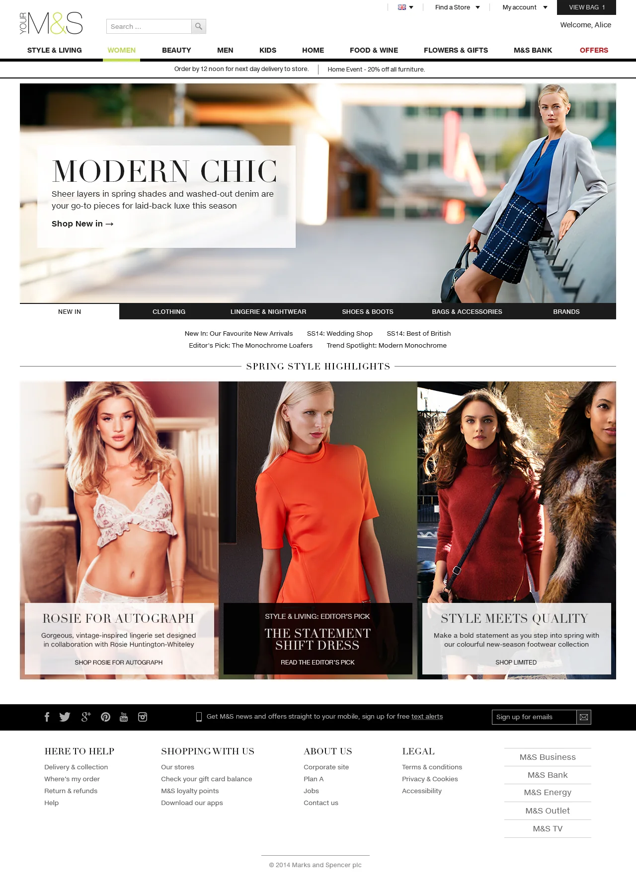
The landing pages were redesigned around flexible, high-quality images and live text.

Style & Living
Editorial publication
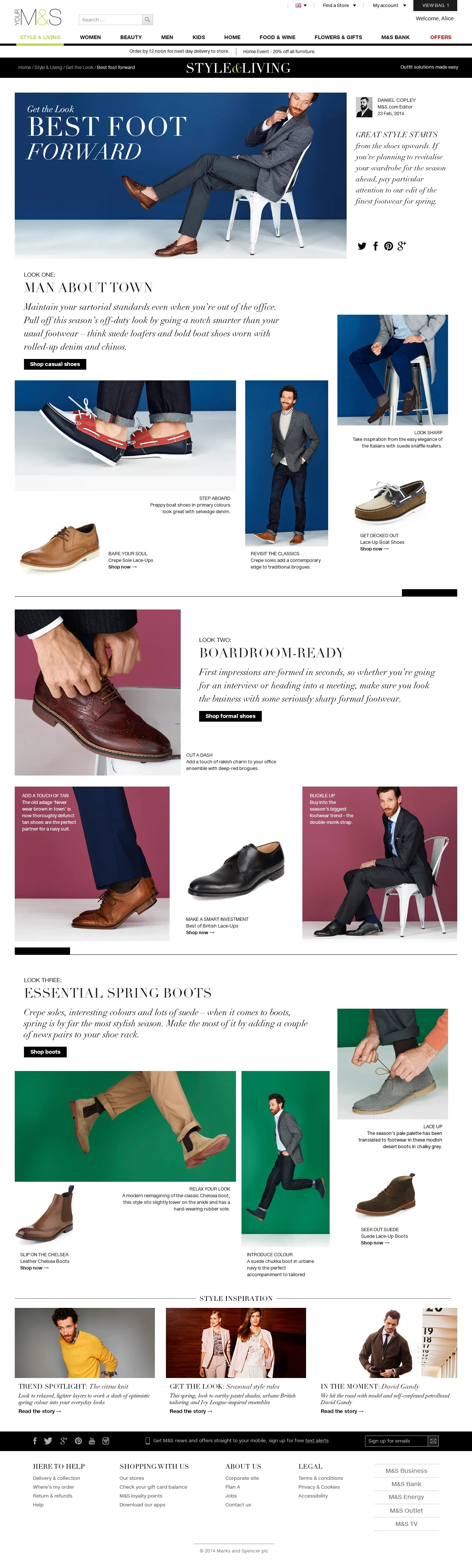
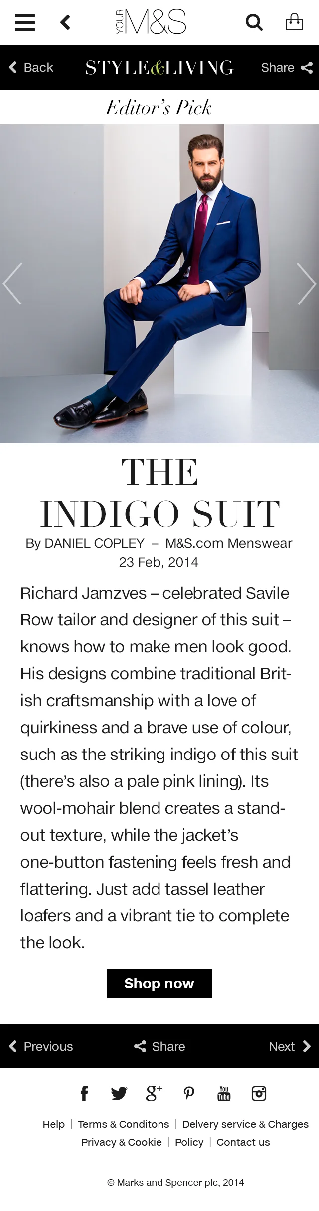
A fashion and lifestyle publication inside the shop, with a daily publishing plan, clean design and editorial photography.
Editor’s Pick
Design & photo art direction
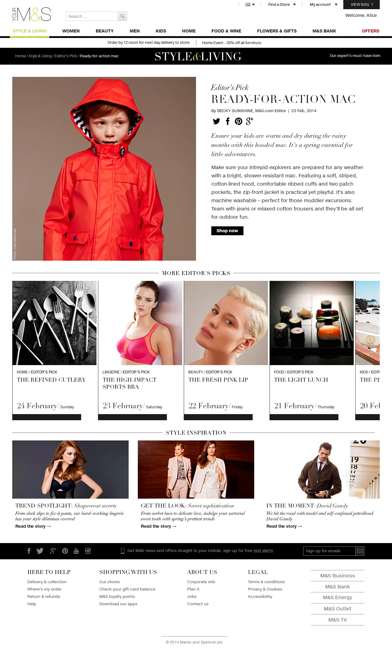
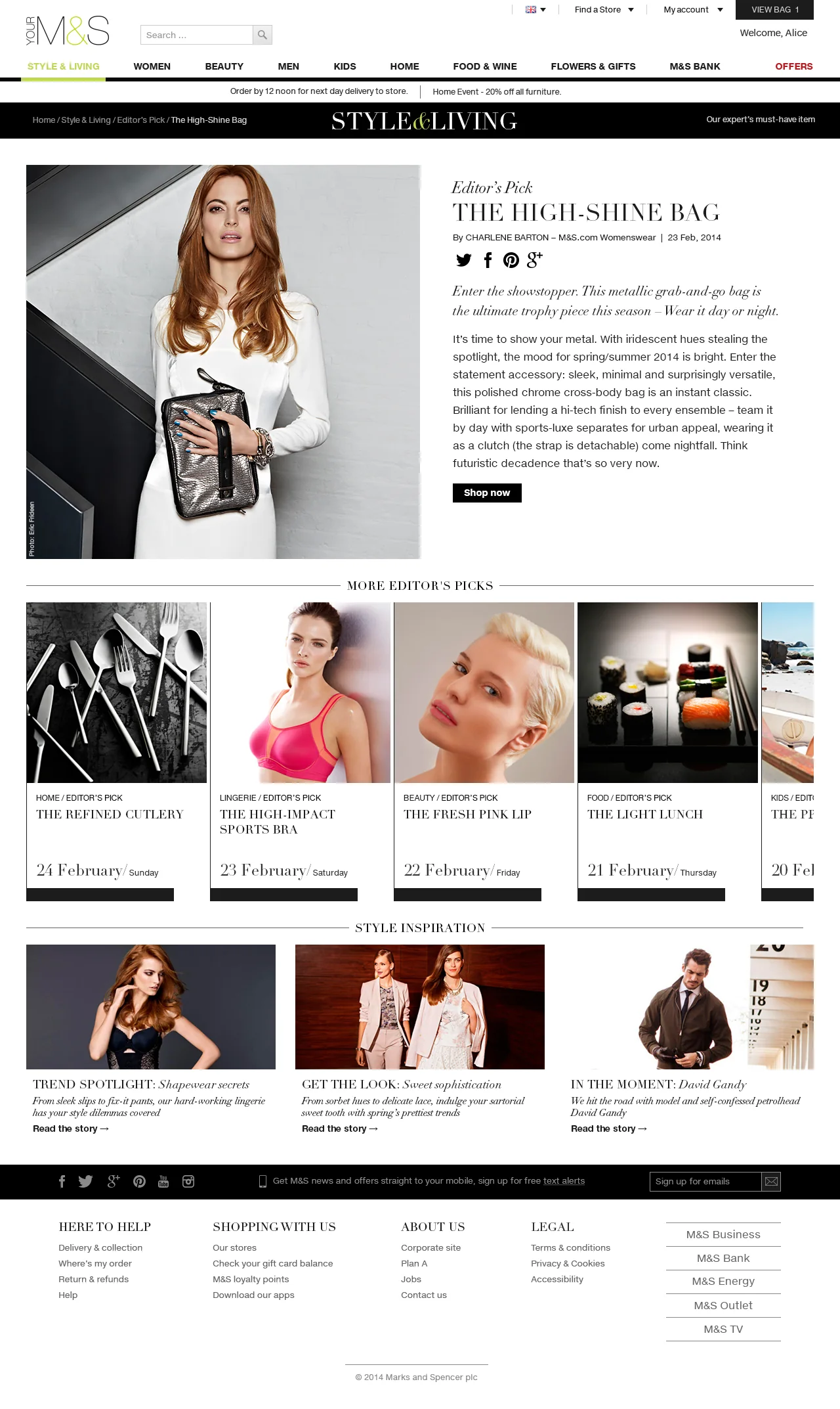
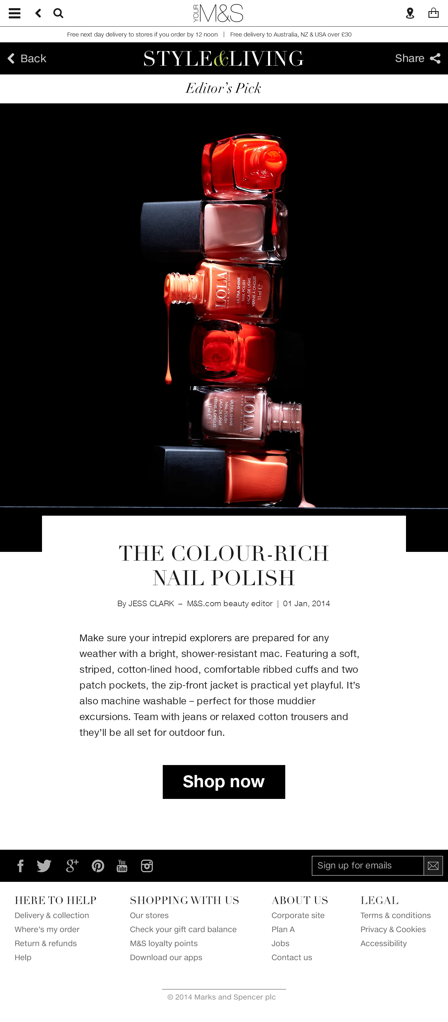
M&S editors select and publish their favourite products from the site.







In the Moment
Design & photo art direction
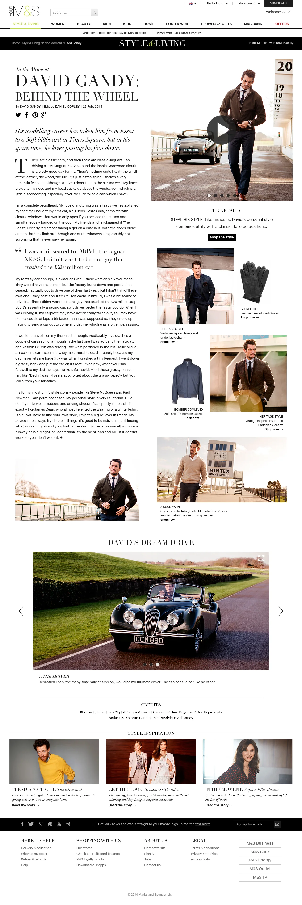
Celebrity guest editors write their own features on fashion and lifestyle.






Get the Look
Design & photo art direction
A fashion advice column on how to style M&S products after the season’s trends.










Mobile & Tablet
Responsive design
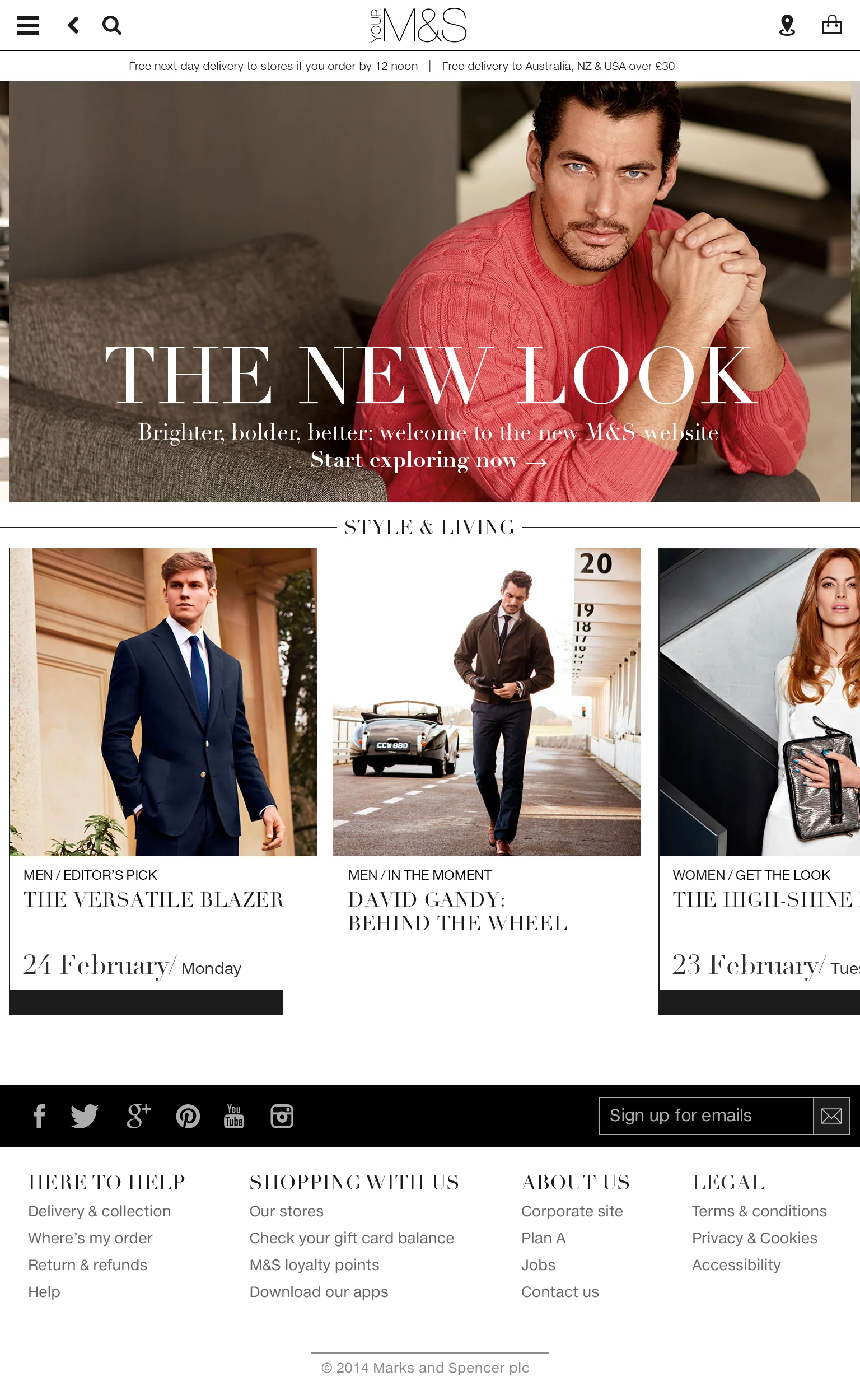
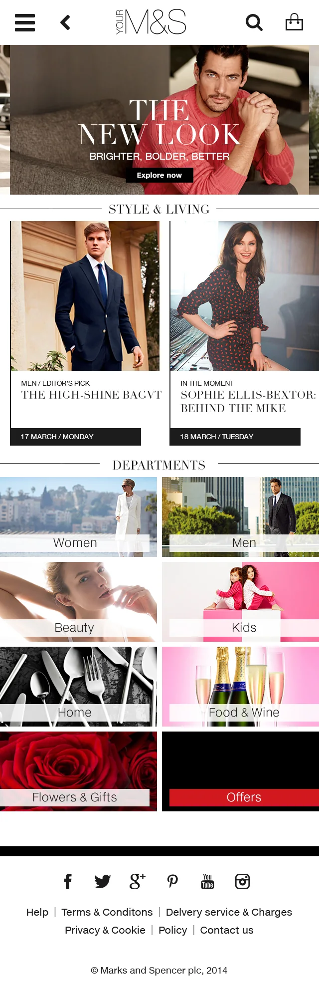
A conscious multi-channel approach: responsive design and flexible imagery that display at their best on every device.
Process
M&S built the new site over two and a half years with its in-house team, SapientNitro and TCS. I led a cross-functional team of more than 20 in London. Fredrik Ahlin and I designed the site and the whole daily publishing, at his kitchen table. In the studio Helen Pearson led photo and I led tech.
Decisions
Leave Amazon for a platform of our own
We moved the site off Amazon's platform onto Adobe CQ, now Adobe Experience Manager, so M&S owned its content and could change the site itself.
Design the publishing with the site
The new M&S.com was built around content, so the site and the daily publishing were designed as one system.
Speed and access as the baseline
Accessibility and performance on every device were the starting point, not a goal for later.
Checkout from first principles
We cut every step we could and kept the trust signals M&S customers expect.
Outcome
The new M&S.com went live in February 2014. Online sales fell 8.1% in the first quarter while customers got used to the new site. After updates, conversion and customer satisfaction rose: in 2014/15 traffic grew 15% and 7 million new customers registered, and in the first half of 2015/16 online sales were up 34%.
Change at scale
A big platform can still be quick to use.
I connect customer experience and technical architecture when an established platform needs more than a new coat of paint.